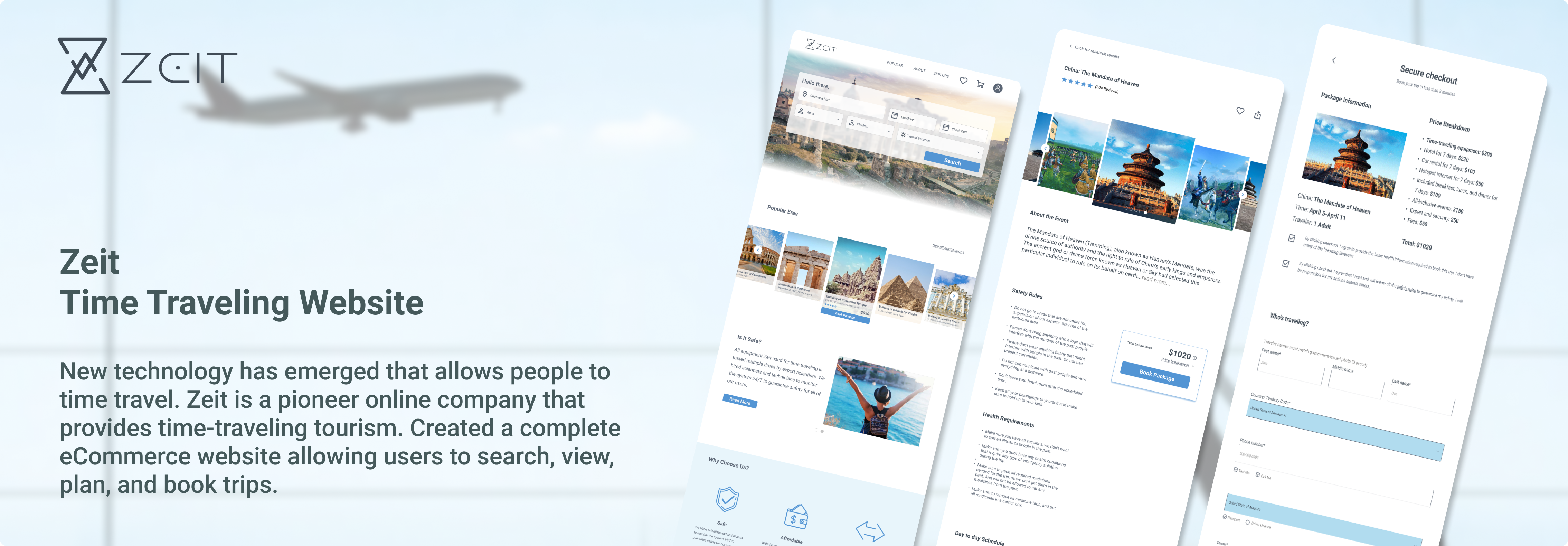
I worked solo on this project as part of my design project with guidance from my mentor.
Four Months
1 Senior UX Designer (Mentor)
UX Designer
Team of 1.
Managing the project
Figma
Whimsical
Adobe Illustrator
Zeit is a company that wants to bring the dream of time traveling to life by allowing consumers to have a unique experience of time traveling in a controlled environment while being able to travel to any era of their choice.
Being a nascent time travel business, many people are afraid of being scammed. People also have many concerns regarding health safety and pricing.
A website that effectively communicates cost and trip information about time travel trips and details health safety requirements.
Since time traveling is a new business, there are no direct competitors. I analyzed 5 indirect competitors. I believe the idea of time travel is an opportunity in itself. However, the basics of a travel website are still relevant for me to learn from.

With little insights gained from competitive analysis, my next step was to understand the users before I could move forward. I interviewed 4 users with various experiences regarding traveling and booking a trip. I asked open-ended questions to get as much information as possible and summarized the data based on members’ needs, pain points, and frustrations.
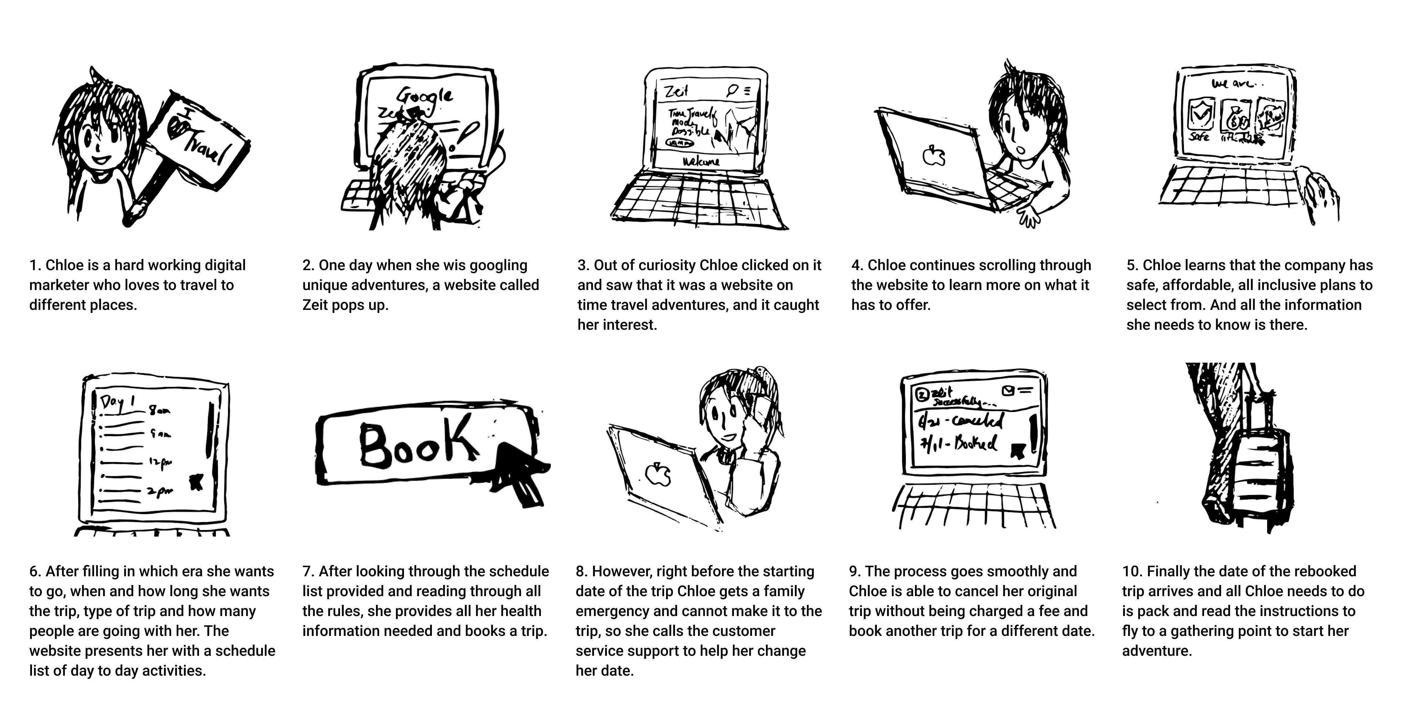
Based on my user research and competitor analysis, I drew out my user storyboard on when and how they will use the app.
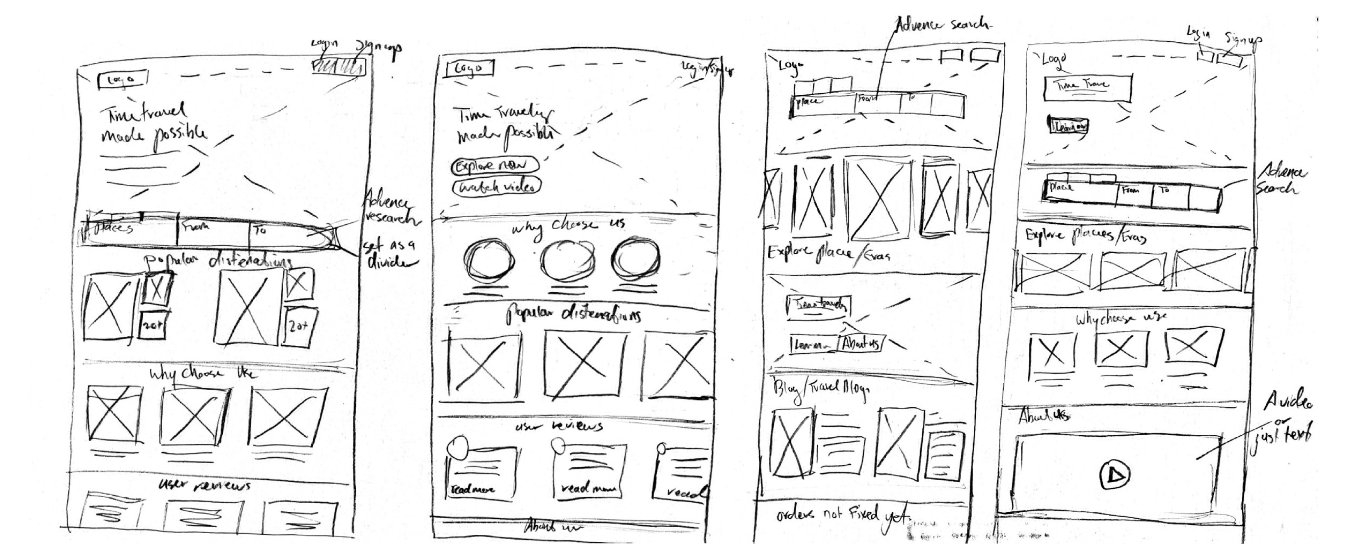
Although time traveling is a brand new concept, I still need to have the basics for a travel website like my competitors. I needed to develop the website layout to see how the users would navigate the website before proceeding to the next step. The most important decision here was to understand how I would interpret the user findings from the website.

After figuring out the website’s layout, I began my initial sketches to understand how I would include the opportunities I found during my user interview on the website.
While the idea of time traveling is new and somewhat scary to users, I wanted to create a brand with a clean, calming, tranquil, sophisticated, safe, and trustworthy vibe. The final color palette accomplishes this while being aesthetically pleasing.

For this website, I kept the typography simple for a sophisticated, trustworthy vibe and chose simple icons and drop-down options for the same purpose.
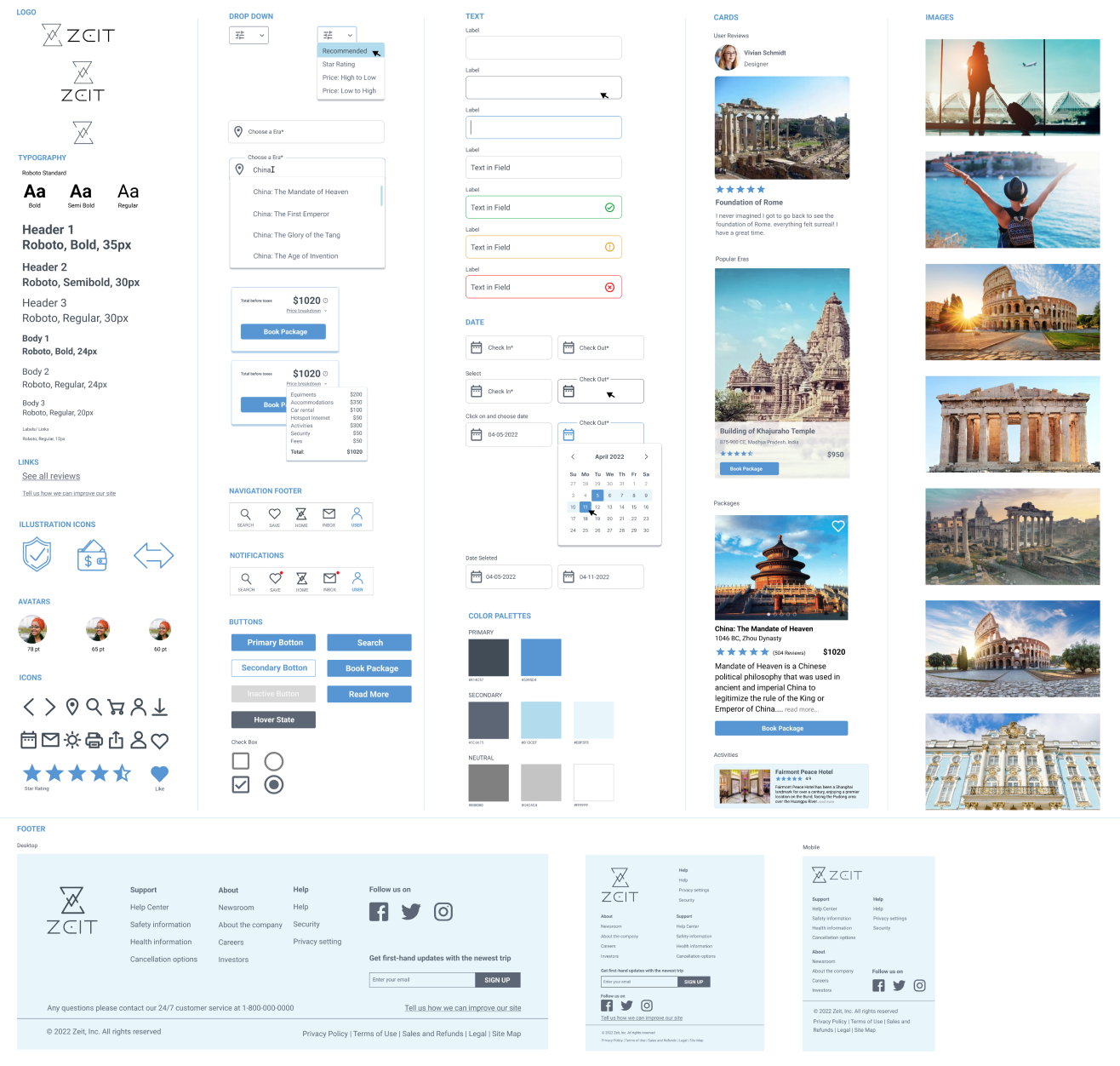
After my initial design, I had my interviewees test the prototype. Most of the feedback was small changes to the UI design. I made a few improvements to overcome the shortcomings.
Added a book package button under each user review so that if any user reading the review is interested in going to the same era can book right on the spot.
Even though Zeit was a hypothetical project, it pushed me to think outside the box and design something I had never thought about before. Seeing a project built from the beginning to the end is exciting. Here are a few things I learned:
Look in different directions. I picked this project as a challenge; I wanted to see what I would do if I were working on a hypothetical project. It was challenging mainly because I did not have direct competitors to learn from. However, I learned a lot from my user interviews, which allowed me to finish my project.
It does not have to be simple. At first, I thought this would be a simple booking app that is not different from other booking apps except that it's time traveling-related. However, after talking to the users, I noticed there are many needs that regular booking apps do not have that allowed me to stand out. I am very grateful for their comments and perspectives as potential users.
Stepping out of my comfort zone. This was my first project, and everything was so new to me. I was anxious as I had never conducted user interviews before. However, after a couple of interviews, I got used to it, and I could do it more naturally. By the time I was doing the usability test, I was very comfortable with the process.